
The Strategic Use of White Space in High-Converting B2B and Service Websites

White space is often misunderstood as empty or wasted space in web design. In reality, it is one of the most powerful strategic tools for improving user experience and increasing conversions.
For B2B and service-based businesses in Oregon and across the United States, white space plays a direct role in how users process information, engage with content, and decide whether to take action.
When used intentionally, white space transforms a cluttered website into a focused, high-converting experience.
What Is White Space in Web Design?
White space, also known as negative space, refers to the empty areas between elements on a webpage. This includes spacing between:
Text blocks
Images
Buttons
Sections
Navigation elements
It is not necessarily white in color. It simply represents unused space that improves structure and readability.
White space is a core part of visual hierarchy and UX design.
Why White Space Matters for Conversions
Most websites fail not because of missing information, but because they overwhelm users with too much information at once.
Without enough white space:
Content feels cluttered
Users experience cognitive overload
Important messages are missed
Calls to action lose visibility
Engagement drops
White space solves this by creating clarity and focus.
White Space Reduces Cognitive Load
Cognitive load refers to the mental effort required to process information.
When a website is crowded:
Users struggle to find key details
Decision-making becomes harder
Attention is scattered
White space reduces this burden by separating content into digestible sections, making it easier for users to understand and act.
How White Space Improves Visual Hierarchy
Visual hierarchy determines what users see first, second, and third on a webpage.
White space strengthens hierarchy by:
Separating primary and secondary content
Highlighting important sections
Guiding the eye through structured flow
Preventing visual competition between elements
This allows users to naturally move toward conversion points without confusion.
White Space and Trust Perception
Design directly influences how users perceive credibility.
Websites with adequate white space often feel:
More professional
More modern
More trustworthy
Easier to navigate
In contrast, cluttered websites can appear outdated or unorganized, even if the services are high quality.
For service businesses competing in Oregon and nationwide markets, trust is a major conversion factor.
The Relationship Between White Space and Readability
White space significantly improves readability by:
Increasing line spacing
Separating paragraphs
Creating breathing room around text
Enhancing contrast between elements
When content is easier to read, users are more likely to stay engaged and move deeper into the site.
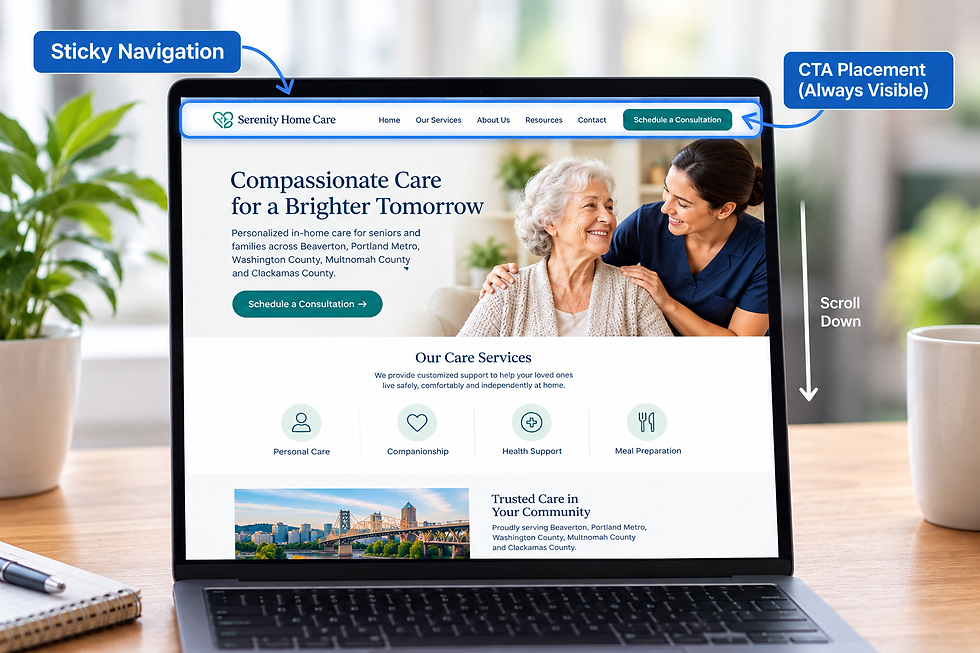
White Space Directs Attention to Calls to Action
Calls to action are one of the most important conversion elements on a website.
White space helps CTAs stand out by:
Isolating buttons visually
Removing surrounding distractions
Creating focus zones
Enhancing clickability perception
A well-spaced CTA naturally attracts attention without aggressive design tactics.
Macro White Space
This refers to large spacing between major sections of a webpage, such as:
Hero sections
Content blocks
Footer areas
Macro white space creates overall structure and flow.
Micro White Space
This refers to smaller spacing between elements, such as:
Line spacing in paragraphs
Padding inside buttons
Gaps between icons and text
Micro white space improves readability and detail clarity.
White Space and Mobile Optimization
On mobile devices, white space becomes even more important due to limited screen size.
Effective mobile white space ensures:
Touch-friendly navigation
Clear content separation
Reduced visual clutter
Easier scrolling experience
For service businesses targeting users across Oregon and the United States, mobile-first white space design is essential for conversions.
Common White Space Mistakes
Many websites underperform because they misuse or underuse white space.
Common mistakes include:
Overcrowded layouts
Lack of section separation
Text-heavy designs without breaks
Buttons placed too close to other elements
No visual breathing room
These issues reduce clarity and discourage engagement.
White Space in Landing Pages vs Websites
White space strategy varies depending on page type.
Landing Pages
Landing pages require more focused white space to:
Eliminate distractions
Direct attention to one goal
Improve conversion rates
Websites
General websites use white space to:
Support navigation
Organize multiple content types
Improve overall usability
Both require intentional spacing strategies.
White Space and Conversion Rate Optimization
White space directly contributes to conversion rate optimization by improving:
Attention flow
Message clarity
CTA visibility
User confidence
Even small spacing adjustments can lead to measurable improvements in engagement and lead generation.
White Space and SEO Performance
While white space is not a direct ranking factor, it influences SEO through user behavior signals such as:
Time on page
Bounce rate
Engagement depth
Scroll behavior
Improved user experience often leads to stronger SEO performance over time.
How Heatmaps Reveal White Space Issues
Heat mapping tools can help identify whether white space is being used effectively.
They reveal:
Where users focus attention
Where engagement drops
Whether content feels overwhelming
If CTAs are being noticed
These insights allow for data-driven design improvements.
Strategic White Space as a Competitive Advantage
In competitive industries, small UX improvements create meaningful differences in performance.
Websites that use white space effectively:
Communicate more clearly
Convert more visitors
Build stronger trust
Stand out visually from competitors
This makes white space a low-cost, high-impact optimization strategy.
Final Strategic Insight
White space is not empty space. It is an intentional design tool that improves clarity, strengthens hierarchy, and guides users toward conversion.
For B2B and service-based businesses in Oregon and across the United States, mastering white space is one of the most effective ways to improve website performance without increasing traffic.
At Yber Digitals, we design high-converting websites using strategic white space, visual hierarchy, UX psychology, and conversion-focused layouts to maximize lead generation and business growth.
Schedule a strategy consultation today to learn how white space optimization can improve clarity, increase engagement, and turn more visitors into customers.
Facebook: https://www.facebook.com/yberdigitals/


Comments