
The Psychology of Visual Hierarchy and How It Directs Visitors Toward Conversion

Every website has a hierarchy, whether it was intentionally designed or not. The difference between high-performing websites and underperforming ones is whether that hierarchy is strategically engineered to guide visitors toward conversion.
Visual hierarchy is the psychological structure that determines what users see first, what they focus on next, and what ultimately influences their decision to take action.
For service-based businesses in Oregon and across the United States, understanding visual hierarchy is essential for turning website traffic into qualified leads.
What Is Visual Hierarchy?
Visual hierarchy refers to the arrangement of elements on a webpage in a way that influences the order in which users process information.
It is based on principles such as:
Size
Color contrast
Spacing
Positioning
Typography
Imagery
Motion and interaction
When used correctly, visual hierarchy creates a clear path that guides users from attention to action.
Why Visual Hierarchy Matters for Conversions
Most websites do not fail because of lack of traffic. They fail because visitors do not know where to look or what to do next.
Without a strong hierarchy:
Users feel overwhelmed
Key messages are ignored
Calls to action are missed
Engagement drops
Conversion rates decline
A well-structured hierarchy eliminates confusion and directs attention toward business goals.
The Psychology Behind Attention Flow
Human attention is naturally limited. Users do not read websites in full. Instead, they scan content in predictable patterns.
Common scanning behaviors include:
F-pattern for text-heavy pages
Z-pattern for landing pages
Top-to-bottom prioritization
Center-focused attention on visuals
Understanding these behaviors allows designers to position important elements where users are most likely to see them.
Above-the-Fold Placement Still Matters
The top section of a webpage remains one of the most critical areas for conversion optimization.
This area should immediately communicate:
What the business does
Who it serves
Why it matters
What action users should take
For service businesses, especially in competitive markets like Oregon and nationwide, above-the-fold clarity often determines whether users stay or leave.
Size and Contrast Guide User Focus
Humans naturally pay attention to larger and more visually distinct elements.
This means:
Headlines should stand out clearly
Calls to action should be visually dominant
Supporting text should not compete with primary messages
Contrast between elements helps users quickly identify what is most important.
Spacing Creates Cognitive Clarity
Whitespace is not empty space. It is a design tool that improves readability and focus.
Proper spacing:
Reduces cognitive load
Separates key sections
Highlights important content
Improves visual flow
Websites that feel “crowded” often suffer from poor conversion performance because users cannot process information efficiently.
Color Psychology Influences Action
Color plays a significant role in visual hierarchy.
Different colors can:
Draw attention to calls to action
Establish trust and professionalism
Create emotional responses
Differentiate interactive elements
Consistency in color usage helps users understand what elements are clickable or important.
Typography Guides Reading Order
Typography is a powerful hierarchy tool that shapes how users consume content.
Effective typography includes:
Clear headline structure
Consistent font sizing system
Readable body text
Strategic use of bold emphasis
A well-structured typographic system ensures users move through content in the intended order.
Imagery Directs Emotional Engagement
Images are often the first elements users notice.
They should be used to:
Reinforce messaging
Establish credibility
Show real-world context
Guide attention toward key actions
For service-based businesses, authentic imagery often performs better than generic stock visuals because it builds trust.
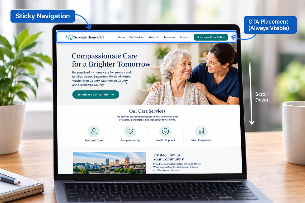
Calls to Action Must Be Visually Dominant
A common conversion issue is weak or poorly placed calls to action.
Effective CTAs should:
Stand out visually
Use action-oriented language
Be placed at natural decision points
Be repeated strategically throughout the page
If users cannot easily identify the next step, conversion rates will suffer.
Heatmaps Reveal Hierarchy Gaps
Heat mapping tools provide insight into how users actually interact with your website.
They reveal:
Where users click
How far they scroll
What elements are ignored
Where attention drops off
These insights help identify breakdowns in visual hierarchy that may not be obvious during design.
Mobile Visual Hierarchy Is Even More Critical
On mobile devices, screen space is limited, making hierarchy even more important.
Mobile optimization should prioritize:
Simplified layouts
Clear CTAs
Reduced distractions
Fast-loading visual elements
For businesses targeting customers in Oregon and across the United States, mobile-first hierarchy design is essential for capturing leads.
Visual Hierarchy and User Trust
A well-structured page does more than guide attention. It builds trust.
When users experience:
Clear structure
Professional design
Logical flow
Easy navigation
They are more likely to believe the business is credible and reliable.
Trust directly influences conversion behavior.
How Visual Hierarchy Impacts SEO Performance
Although visual hierarchy is primarily a UX concept, it also affects SEO indirectly.
Strong hierarchy improves:
Engagement metrics
Time on page
Bounce rates
Conversion rates
User satisfaction signals
These behavioral metrics contribute to overall search performance and ranking potential.
Aligning Hierarchy With Business Goals
Every page should have a defined purpose.
Visual hierarchy should support that purpose by guiding users toward:
Contact forms
Consultation bookings
Phone calls
Service inquiries
Without alignment, even well-designed pages may fail to generate leads.
Final Strategic Insight
Visual hierarchy is not just about aesthetics. It is a behavioral framework that influences how users think, where they look, and what actions they take.
When applied strategically, it transforms websites into guided experiences that naturally lead visitors toward conversion.
For service-based businesses in Oregon and across the United States, mastering visual hierarchy is one of the most effective ways to improve website performance without increasing traffic.
At Yber Digitals, we design and optimize websites using psychology-driven visual hierarchy, conversion strategy, and performance-focused UX principles to turn traffic into measurable revenue.
Schedule a strategy consultation today to learn how visual hierarchy optimization can improve engagement, increase conversions, and strengthen your digital presence.
Facebook: https://www.facebook.com/yberdigitals/


Comments