
Mobile-First Design Beyond Responsiveness: What Users Actually Expect

For years, businesses viewed responsive design as the gold standard for mobile optimization. If a website adjusted to fit different screen sizes, it was considered mobile friendly. While responsiveness is still essential, user expectations have evolved far beyond simply displaying content on a smaller screen.
Today's customers expect fast, intuitive, and frictionless mobile experiences. They want websites that anticipate their needs, simplify decision making, and allow them to complete tasks with minimal effort. Google has recognized this shift through mobile-first indexing, Core Web Vitals, and user experience signals that influence search visibility.
For service businesses in Oregon and throughout the United States, mobile-first design is no longer just a technical requirement. It is a strategic investment that directly affects lead generation, customer satisfaction, search performance, and long-term revenue.
Understanding Mobile-First Design
Mobile-first design is an approach that begins with designing the experience for smartphones before expanding to tablets and desktop devices.
Instead of shrinking a desktop website to fit a phone, designers prioritize the limitations and opportunities of mobile devices from the very beginning.
This philosophy focuses on:
Simplicity
Speed
Accessibility
User intent
Conversion efficiency
The result is a website that performs exceptionally well regardless of screen size.
Why Responsive Design Alone Is No Longer Enough
Responsive websites automatically adjust layouts based on screen dimensions. While this solves display issues, it does not necessarily improve usability.
Many responsive websites still suffer from:
Overcrowded navigation
Tiny tap targets
Slow loading images
Long forms
Difficult scrolling
Poor visual hierarchy
Users may technically access the site on a phone, but the experience remains frustrating.
Modern mobile-first design focuses on user behavior instead of screen adaptation.
Mobile Users Behave Differently Than Desktop Users
Understanding mobile behavior is critical for designing effective experiences.
Mobile users are more likely to:
Search while traveling
Need immediate answers
Compare multiple providers quickly
Call businesses directly
Expect instant page loading
Browse with one hand
These behaviors require different design priorities than traditional desktop browsing.
Service businesses that recognize these behavioral patterns often outperform competitors who simply rely on responsive layouts.
Speed Is the First User Expectation
Performance is one of the strongest indicators of mobile success.
Users expect websites to load almost immediately. Even small delays increase bounce rates and reduce conversions.
Improving speed involves:
Compressing images
Minimizing JavaScript
Optimizing server response times
Using browser caching
Eliminating unnecessary scripts
Google also considers page performance through Core Web Vitals, making speed valuable for both SEO and user experience.
Navigation Should Feel Effortless
Mobile visitors should never struggle to find information.
Effective mobile navigation includes:
Simple menus
Clear service categories
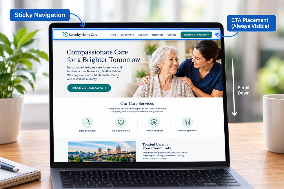
Sticky navigation when appropriate
Prominent contact options
Logical page organization
Every additional tap creates friction that can reduce conversions.
Businesses serving customers across Oregon and the United States should prioritize intuitive navigation that supports quick decision making.
Touch-Friendly Design Is Essential
Unlike desktop users, mobile visitors interact with their fingers rather than a mouse.
Design elements should include:
Large tap targets
Adequate spacing between buttons
Swipe-friendly interfaces
Easy-to-read typography
Accessible form fields
Small clickable elements increase frustration and lead to abandoned sessions.
Visual Hierarchy Must Adapt to Small Screens
Screen space is limited on mobile devices.
Designers must prioritize information carefully by emphasizing:
Strong headlines
Clear value propositions
Visible calls to action
Essential trust signals
Less important information should appear later in the user journey.
This structured approach improves engagement and increases conversions.
Above-the-Fold Content Matters Even More
The first screen users see often determines whether they continue browsing.
A mobile-first hero section should immediately communicate:
What your business offers
Who your services are for
Why customers should choose you
What action users should take next
Visitors should never need to scroll just to understand the purpose of the page.
Forms Must Be Designed for Mobile Completion
Lengthy forms are one of the biggest barriers to mobile conversions.
Optimized mobile forms should:
Ask only for essential information
Use large input fields
Support autofill
Display the correct mobile keyboard
Minimize typing whenever possible
Reducing friction often results in significantly higher lead conversion rates.
Local Search Makes Mobile Optimization More Important
Many mobile users perform local searches with immediate intent.
Examples include:
Digital marketing agency near me
Website designer in Oregon
SEO consultant nearby
These searches often lead directly to phone calls, appointments, or quote requests.
A mobile-first experience supports these high-intent users by making contact information, directions, and service details easy to access.
Mobile-First Design Supports Better SEO
Google primarily evaluates websites using their mobile versions.
A strong mobile experience improves:
Crawl efficiency
User engagement
Time on page
Bounce rate
Search rankings
Businesses that prioritize mobile usability are better positioned for long-term organic growth.
Accessibility Is Part of Modern Mobile Design
Mobile-first websites should also accommodate users with varying abilities.
Accessibility improvements include:
Readable font sizes
High color contrast
Screen reader compatibility
Keyboard navigation support
Descriptive button labels
Accessible websites provide better experiences for all users while supporting broader SEO objectives.
Trust Signals Should Be Immediately Visible
Users evaluate credibility within seconds.
Important trust elements include:
Customer reviews
Industry certifications
Awards
Client logos
Years of experience
Displaying these signals early builds confidence before users reach conversion points.
Continuous Testing Drives Better Results
Successful mobile-first design is an ongoing process.
Businesses should regularly analyze:
Heatmaps
Scroll depth
Click tracking
Session recordings
Conversion data
Behavioral insights help identify friction points and reveal opportunities for continuous improvement.
Why Mobile-First Design Is a Competitive Advantage
As customer expectations continue to rise, businesses that provide exceptional mobile experiences gain measurable advantages.
These include:
Higher conversion rates
Lower bounce rates
Better customer satisfaction
Improved search visibility
Greater return on advertising investment
For service businesses operating in competitive markets, mobile-first design becomes a significant differentiator.
Final Strategic Insight
Responsive design solved yesterday's problems. Mobile-first design addresses today's customer expectations and prepares businesses for tomorrow's digital landscape.
Success is no longer measured by whether a website fits a mobile screen. It is measured by how effortlessly users can accomplish their goals.
For service businesses across Oregon and throughout the United States, investing in a mobile-first strategy improves SEO performance, strengthens user trust, increases conversions, and supports sustainable growth.
At Yber Digitals, we create mobile-first websites that combine performance optimization, user experience strategy, conversion psychology, and technical SEO to help businesses generate more qualified leads and maximize digital marketing ROI.
Schedule a strategy consultation today to discover how a true mobile-first strategy can elevate your website, improve customer experience, and drive measurable business growth.
Facebook: https://www.facebook.com/yberdigitals/


Comments